top of page

Top of the page
Bank of America
Budgeting for College Students
Banking app with personalized budgeting & savings features, plus an exciting gamification element to help college students save money and build a strong financial foundation


Overview
Primary focus is to provide college students with a visual representation of their budgeting and savings history.
Aim to create an intuitive and user-friendly interface that allows students to easily track their financial progress, make informed decisions, and develop healthy saving habits. By incorporating visual elements and interactive features, our goal was to empower users to take control of their finances and build a secure financial future.
The Challenge
Designing a visually compelling and user-friendly interface
Find a way to present complex financial data in a simple and intuitive manner, ensuring that users can easily understand their financial status and make informed decisions. Additionally, striking the right balance between providing relevant information and avoiding overwhelming the users with excessive details will be crucial to keep them engaged and motivated to use the app regularly.
The Solution
Integrate new budgeting feature into an existing Bank of America mobile app
Our banking app will feature a personalized dashboard that visually presents financial data through charts, graphs, and progress bars, showcasing their budgeting and savings achievements. We will also implement a fun rewards system to gamify the saving process, motivating users to reach their budget goals and foster healthy financial habits.
My Role
Crafting user-centered design solutions
As a UX Designer on a team of 4, my responsibilities included conducting thorough research, translating concepts into wireframes and prototypes as well as perform user testing and make necessary iterations based on feedback received.
Timeline
2 weeks


DISCOVER
The first phase of our research was discovery, and we created a survey that would collect some quantitative data from our target demographics which were college students. Our survey contained 12 questions. 63.2% were college students. Questions ranged from favorite form of payment to tracking their monthly expenses. This survey was extremely helpful as we had gone in with the mindset of focusing on loans and investment. 52.6% did not invest and 45.9% did not have a loan of any sort.


Some candidates that did the survey, moved forward with an interview. A total of
12 people were interviewed ranging from college students, post grads and early 30s. We learned more about their financial stresses and users are more focused on monthly budgets and keeping a strong savings account.
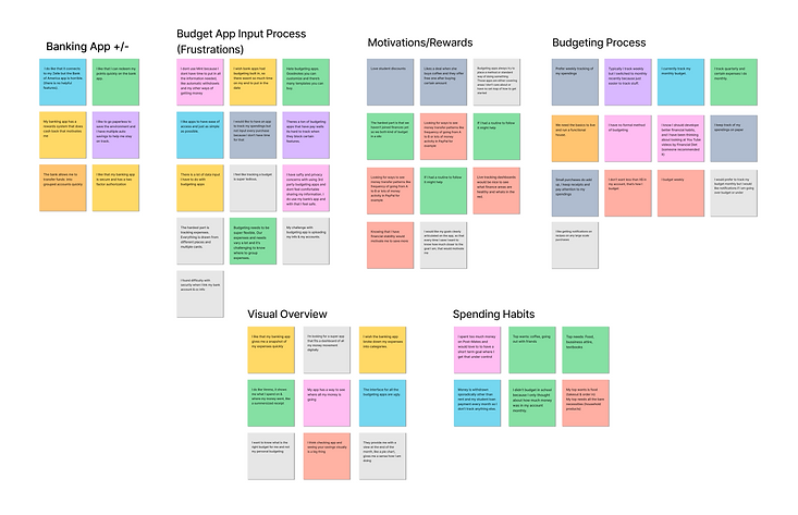
Key Insights

“I wish the banking app broke down my expenses into categories.”
“I like points & rewards. I
like that I can redeem my points quickly on the app.”
“I think checking app and seeing your savings visually is a big thing.”
After conducting user interviews, we found that most young adults prefer easily digestible visuals that give them an overview. They also wanted editable categories for budgeting that are easy to maintain with monthly recurring expenses. Additionally a rewards system was highly desired.
Competitive & Comparative Analysis
Feature Inventory

Task Analysis (set up monthly budget)
This task was to set up a monthly budget. Chase has an easy feature. However, it did not really focus on its visuals. It took about 10 steps to set up a monthly budget. Mint & Every dollar are a budget focus third party app that allows a bit more detailed budget options than Chase & BoA. Both took six steps for a user to set up a monthly goal.


Task Analysis (set up a savings goal)
Next was a savings goal task on Every Dollar, Mint and Chase. Unfortunately Every Dollar did not offer this option unless you paid a premium upgrade. This helped us gather what we wanted to include in our BoA feature.


DEFINE
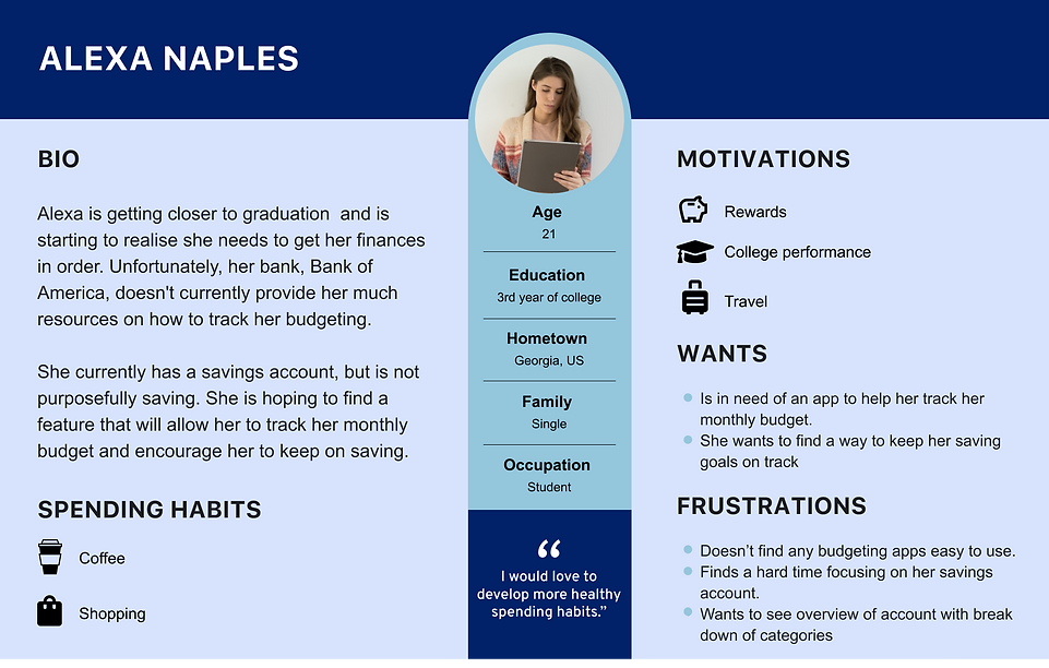
The data collected from user interviews & questionnaire led us to develop a persona.
We now can define our problem statement which led us to think about how we might be able to make budgeting fun and easy for college students? How might we find a way to visually show college students their current budgeting and saving habits? How might we encourage students to budget and save more?
Problem Statement
Alexa needs a visual overview of monthly spending habits and a fun way to save more money so she stays motivated for her financial future.
How might we help Alexa create a highly visual budget and help her develop healthy savings habits?
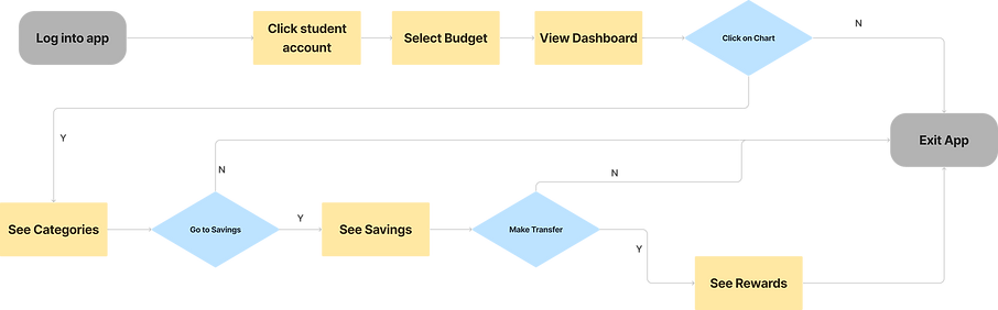
As our team began brainstorming to find answers, we were able to narrow down the problem into two main tasks. The first was to create a budget of the user’s monthly expenses using recurring expenses from previous months. Our user, Alexa, would replicate these expenses and make adjustments to the budget. The next task was for Alexa to view the visual summary of her expenses and see her savings that month from her budget. She would then transfer that amount that was saved from her checking to her savings account and be rewarded points which she could use later.
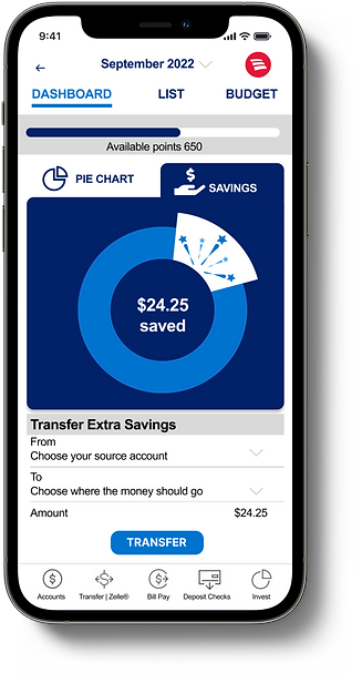
Task 1: Login to your Bank of America account and edit your monthly budget

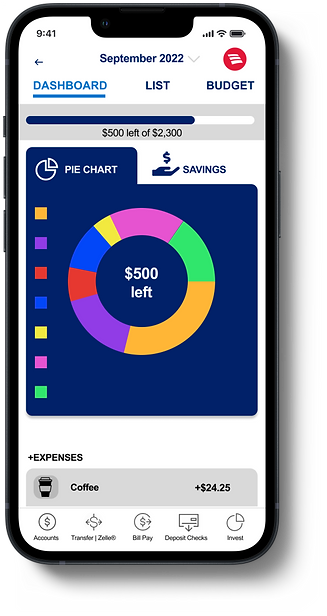
Task 2: View your monthly pie chart and transfer your saved cash to your savings account
DESIGN
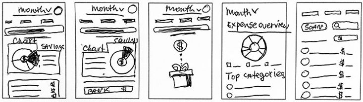
Sketches
Usability Testing
We conducted a usability test through Maze by sharing it with 5 testers. We asked them to view the monthly pie chart and transfer saved cash to a savings account. 80% of testers gave up or left the mission. We wanted to see why, so we conducted another 5 person usability test & this time we observed the testers. We realized that the buttons were confusing for the users. For the savings feature, users did not know to scroll down to see the transfer button, and abandoned the task. They were confused by the term transfer, and needed more clarification on what was being transferred. Users also wanted the chart to be more interactive.


It was not clear to users how to edit their budget. So, I changed the contrast in the top navigation so users could see them better. Based on feedback, we also redesigned the call to action buttons to make them more noticeable with better contrast.

Previous buttons
New buttons, based on feedback
Insights to Features

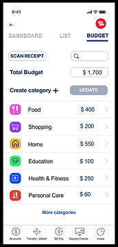
Added new Budget button to home screen
Added new Budget icon to top navigation
DELIVER
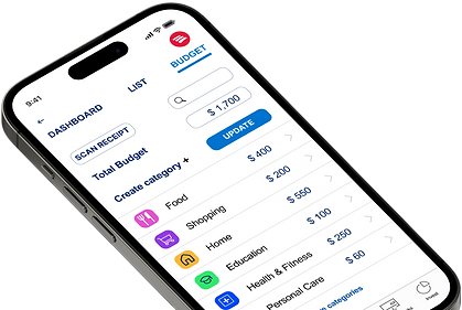
Recurring expenses are easy to edit and customize for budgeting categories.

Highly visual budget and savings dashboard
NEXT STEPS
Go up
-
Expand on more ways to gamify rewards
-
Bring in education resources into the budget motion
-
More usability testing
bottom of page