The Black Alumni Collective
Hackathon event website to boost registration and engage schools
To address the previous year's issues of low participation and limited information, we developed a dedicated website specifically tailored to meet the requirements of the school.
Overview
Ensure greater visibility and accessibility for participants
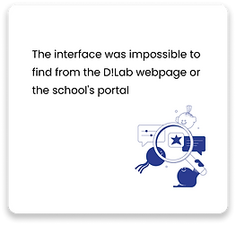
Feature information about the hackathon on the dedicated website, eliminating the challenges of locating event details that were previously hidden within the D!Lab website of Saint Andrew's Episcopal School.
The Challenge
Streamline the registration process and enhance the user experience
Make the target user's experience easy during their registration process and provide them with detailed information about current and past hackathons.
The Solution
Build a website to serve as a central hub for hosting info about current & past hackathons
Create a standalone website for HackBAC that supports the registration process and increases discoverability & participation nationwide.
My Role
Crafting user-centered design solutions
On a four-person team, I conducted research, created wireframes and prototypes, performed user testing, and redesigned the final UI.
Timeline
2 weeks


How easy is it to register for current hackathon?
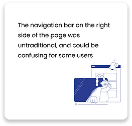
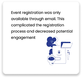
We began by doing a heuristic evaluation on last year's HackBAC website where we assessed how easy it is to find information on current & past hackathons and to register.
Key Insights
Researching the Competitors
How does HackBAC compare to the competition?
Given the prompts, we looked at other competitors that offer similar resources and events to gain insights and obtain inspirational design ideas.


Different competitors had standard features such as registration, tracks, about us, about the sponsors, and FAQs.
Most sites have a clear navigation system, call to action, and consistent branding of their organization and what they offer. We noticed that these elements are important for the user to find information to participate in registering for the event.
15 User interviews with the target audience
Along with the competitor analysis, we moved on to user interviews to understand the target audiences’ experience and their needs when registering students for an event.
We interviewed 15 target users from the list provided by our stakeholders, they were division directors and DEI coordinators that understand the premises in finding and registering events for the students.
From the interviews, we obtained insights and learned about their experience. We grouped the information into the following categories.
Information
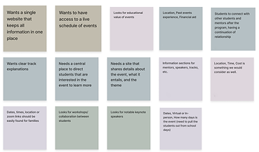
Registration
Organizational Structure
Key Insights
After creating our affinity map based on the responses we received, we used this information to create these problem statements, which define the problems that users associate with registering for the event. We used these problem statements to effectively inform the rest of our design process.
Problem Statements
HackBAC: HackBAC needs a central landing page for their event so that more schools and students will register.
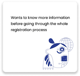
Administrators, DEI Directors, etc.: Users need to have access to necessary registration information so that they can easily fill out the form on eventbrite.
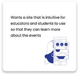
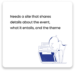
Students: Users need to have access to organized and thorough event details so that they can decide if they want to participate.
Another way we kept ourselves focused on solving the necessary, user-driven problems were how might we questions, which are intended to narrow down the scope of what we are solving and put down our goals in writing.
• How might we help users learn about HackBAC?
• How might we help users learn about last year’s event?
• How might we help users find the registration site?
• How might we help users learn the details of this year's event?
• How might we help users to know what other schools have participated?
• How might we help users learn what tracks are?
• How might we provide an intuitive experience for all users?
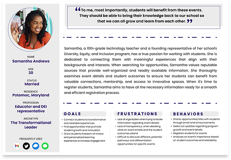
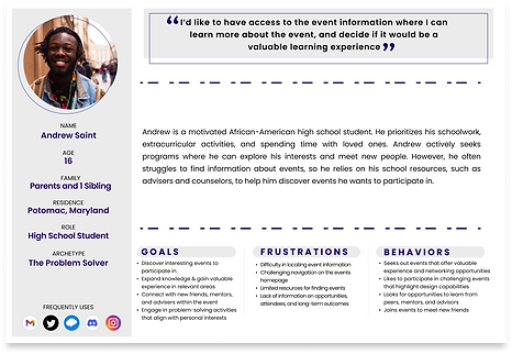
Target User
The following user personas were created as stand-ins for real users of the site, using information given to us in interviews, to generalize the target audience and humanize our approach to our design.
To address the issue of disorganization experienced by Andrew, we created card sorting survey. This survey enables potential site users to categorize all the information that will be on the site in a way that makes sense to them, ensuring a more organized and user-friendly experience.
15 Card sorting participants
Key Insights
15 participants created 4 main categories: About, Contributors, History, and This Year’s Event, with between 50 and 100% of people placing the topics into one of these categories.
4 Main Categories
ABOUT
HISTORY
CONTRIBUTORS
THIS YEAR'S EVENT
Site Map
Using this information, we created a Site Map for the HackBAC 2023 website. We placed these topics under the categories mentioned previously to give ourselves a road map for when we began designing the site itself.

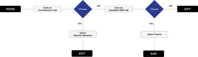
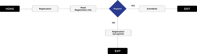
User Flows
We used our site map to create user flows that show the best route for users to complete tasks on our website.
Learning about HackBAC 2023
Registering for HackBAC 2023
From Sketches to Digital Wireframes


Sketches from our Design Studio Session
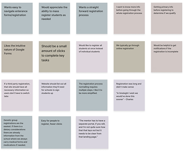
Throughout the process, we carefully considered the limitations of the no-code platform provided by the client. We checked SquareSpace's constraints to ensure that each decision we made was achievable. To bring our designs to life, we created a mid-fidelity prototype.

With this mid-fi prototype, we conducted 12 usability tests with adults & H.S. students, gaining insight from both of our target user groups.
“I can have more information if I want, but I’m not visually overwhelmed straight away.”
-Participant 2
“Nice having this info specifically for this year, that makes it very easy”
-Participant 8

Design Guide
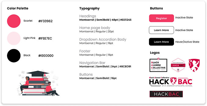
We decided to retain the existing brand colors of red and black while introducing a new color, pink, to infuse a fresh and vibrant element into our design system. This addition allows us to maintain brand consistency while bringing a touch of innovation and uniqueness to our visual identity.
Key Insights to Improve
5 users were confused about “history” as the title for the previous events page
3 users felt the font sizes were too large
2 users were confused about the design of keynote speakers being larger on the contributors' page
Based on our users’ feedback, we discovered that the history tab, which contained details about past events, was not intuitive and resulted in a confusing navigation experience. Interestingly, six users suggested that organizing past events would be more logical and user-friendly.

Mid-Fi wireframes

Hi-Fi wireframes

Redesigned UI
Changed "History" to "Past Events" to clarify information available on that page
Users also said that our fonts seemed large and intrusive. We downsized the fonts and call to action buttons to make the pages cleaner, while still maintaining legibility.
Mid-Fi wireframes

Hi-Fi wireframes

Redesigned UI
Downsized fonts and call to action buttons

Mid-Fi wireframes

Hi-Fi wireframes

Redesigned UI
We addressed user confusion by adjusting the design to ensure the visual consistency of the keynote speakers' presentation on the contributors' page, improving the overall user experience.
Final Web Pages

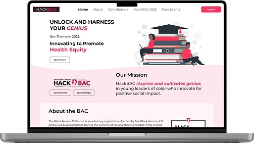
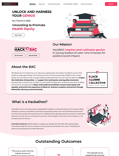
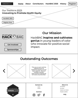
Home Page
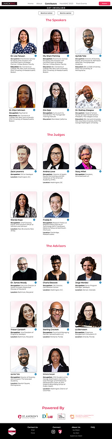
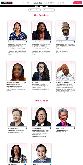
Contributors Page


Registration Page

FAQ Page
Current Hackathon Page
Next Steps
-
Continue our partnership and further develop the design for our client.
-
Maintain and adapt the site as HackBAC grows from year to year.
Final Thoughts
Reflecting on the completed project for the Hackathon event website design, I worked collaboratively with a team of four designers. Although I didn't have the opportunity to design the UI initially, I embraced the chance to focus on research, which pushed me out of my comfort zone. After the project's completion, I took the initiative to redesign the UI according to my vision. Throughout this experience, I learned the significance of being a supportive and cooperative teammate.