top of page


On Stage
Dancewear
A retailer in New York City. Offering the largest selection of dancewear and shoes, with over 50 brand names and speciality products.
.png)
OVERVIEW
Background
On stage dancewear, an online retailer specializing in dancewear and shoes, needs to improve their browsing & checkout experience.
60% of users abandon the site without adding items to their cart because they are unable to find a garment in specific color or size. Global navigation does not offer clear understanding of the categories offered.
Role
UX/UI Designer
Timeline
2 Weeks
Tools
Figma
Desired Outcomes
Make the customer feel confident and comfortable during their shopping experience that will give them options to sort through available choices, ultimately leading to a complete purchase.
Solution
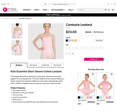
Create informative product pages with balanced visuals and descriptions that offer multiple sort options.

Discover
How easy is it to navigate the current website?
I conducted a heuristic evaluation, where I assessed how easy it is to use the current e-commerce platform for users based on industry standards.
Key Insights
-
Global navigation - Bodywear tab does not distinguish between adult and kids
-
Inconsistency with global navigation lists
-
Limited options to sort by (ex. color, size, fabric content etc.)
How does On Stage Dancewear compare to competition?
I conducted a competitor analysis of several top e-commerce dance retailers sites to have a better understanding of their shopping experiences. I assessed them based on how they achieve solving the problems that On Stage Dancewear is currently facing. These competitors included: So Danca, Dancewear Solutions, Capezio & Move Dance.


"Where is the sort option to just choose pink color?”
“I am getting frustrated scrolling through all the items."
“I can’t find the kids section.”
Following the heuristic evaluation and competitive analysis, I conducted user interviews, asking the user to complete the following task on the current website. The first task was to purchase kids pink leotard in size 8-10.
CARD SORTING
In order to understand how users would navigate through the website, I analyzed 10 open card sorting studies where participants grouped 20 products and created labels that made sense to them. This allows me to best understand how to structure the information architecture and layout of OnStageDancewear website.
Key Insights
-
Many category titles were considered as main categories such as "Kids", "Men", “Women” and “Shoes” in card sorting.
-
Participants grouped specific type of items together, such as tutu-dresses & dresses and gave a category dresses which shows the need for secondary categories.
Define
USER PERSONA
With the data collected from my research, I created a persona representing a target user, to understand the user’s frustrations, goals, and needs.

PROBLEM STATEMENT
Naomi needs many sorting options on each dance garment so that she can make her online purchase quickly and efficiently.
SITE MAP
Planning Information Architecture and the Customer Experience
I used the insights from my research to create a site map that would allow for organized content, logical flow, and a seamless experience for the customer.

Design
SKETCHES
I sketched a few versions of detailed product pages with different looks of added features.


MID-FIDELITY WIREFRAMES
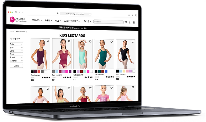
Global navigation with local categories is now organized and easy to search. I added new features - dropdown menus with color, size, style, price, brand, material. I also added color swatches, add to favorites and review stars under each item.


USER TESTING


bottom of page